Role: UX-UI Designer
Responsible for translating visual concepts into interactive prototypes, ensuring the website’s modular scalability, and facilitating hand-off and articulation with the development team.
Team: Digital Factory @ EDP
Lisa Hartje Moura – Creative designer
Wingman (Deloitte Digital PT) - Development team
Creation of a ground-breaking content platform for the Museum of Art, Architecture and Technology, MAAT.
In 2020, MAAT Museum introduced a new visual language.
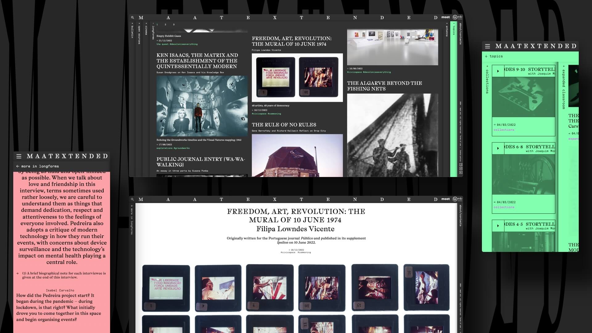
MAAT ext. was created as a content platform to extend the museum's activities, aggregate and connect into the digital realm.
The challenge was to ensure easy navigation for regular users with MAAT's brutalist visual aesthetic. The museum team wanted a brutalist website that would be remembered for its visual disruption.
This project was delightful as it allowed me to explore brutalism aesthetics, a style I've always been curious about. Collaborating closely with Lisa, MAAT's main graphic designer at that time, made the process seamless.
Lisa led the visual concept for the website, while I focused on the development of a modular structure that, despite its brutalist appearance, offered a cohesive user experience.
Concept
The initial concept was born out of collaborative working sessions, inspired by the concept of old archive folders, where users navigate by expanding and collapsing folders to search for content.

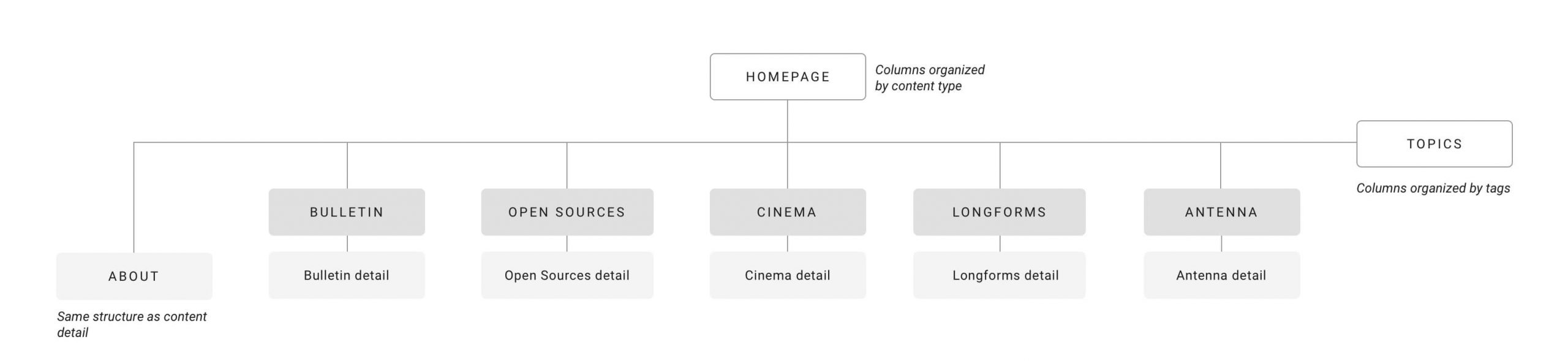
MAAT ext. navigation architecture. We established four page types:
homepage, topics, content type menu, and content detail (article detail).
Working closely with MAAT’s content team, we decided that each menu should have its unique appearance. For example, cinema thumbnails should differ from long-form content due to their varying content types.
We developed wireframes to analyze the implementation of a modular structure and test concepts for scalability on components with multiple combined elements.
Then came the first visual experiments:
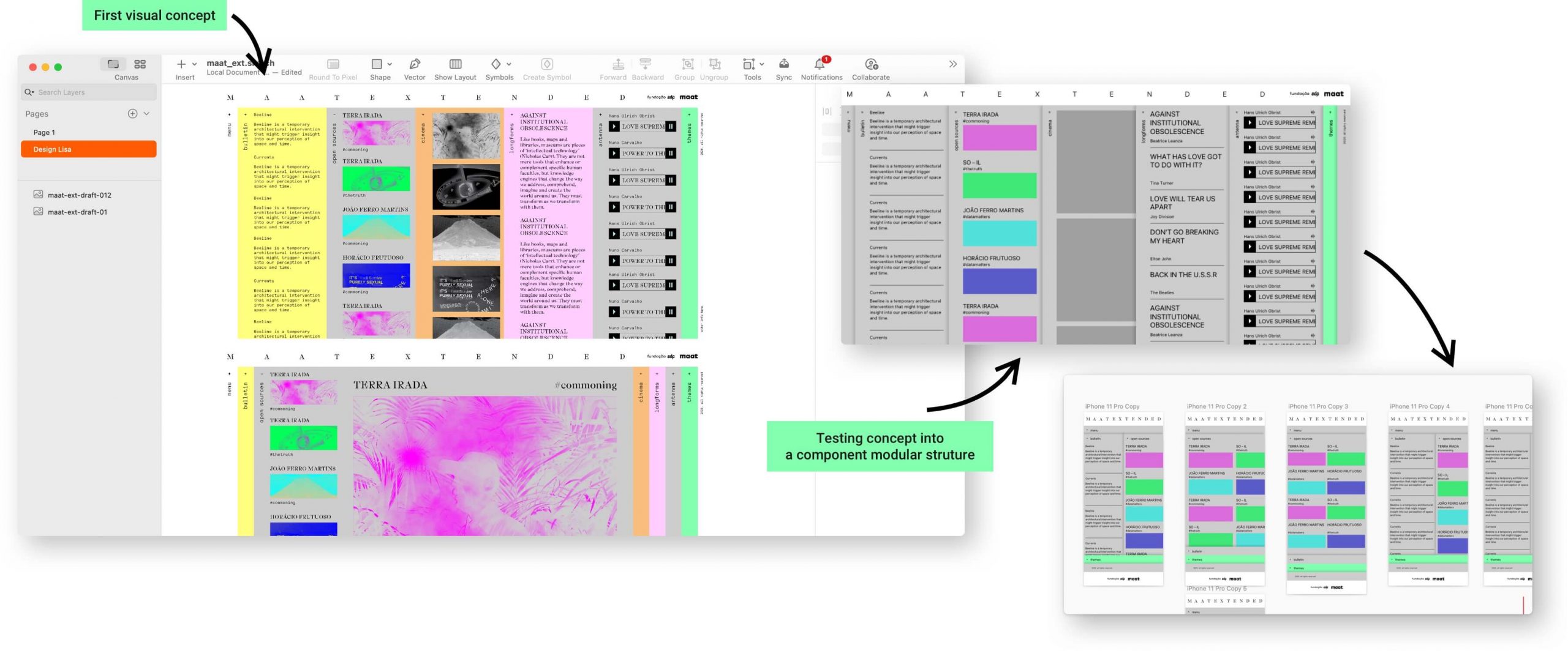
Transitioning from the initial visual concept (left) to a component modular structure (right). I utilized a baseline of 8px to maintain compatibility across all elements and components.
Setting the order in chaos
Seems like a chaotic and aleatory content website but there is a lot of order. After exploring different structures, we established a set of rules:
- On the homepage, content is organized by theme
- On the topics page, content is presented by categories (tags), with different cards combined within the same content column so users can navigate by tags, similar to a newspaper website.
- The speed of each column should be defined on the content editor tool.
- On the home and topics pages, to enable infinite color schemes, on the content editor area it's possible to choose the color for 4 items: background, text, tags and shadow colors.
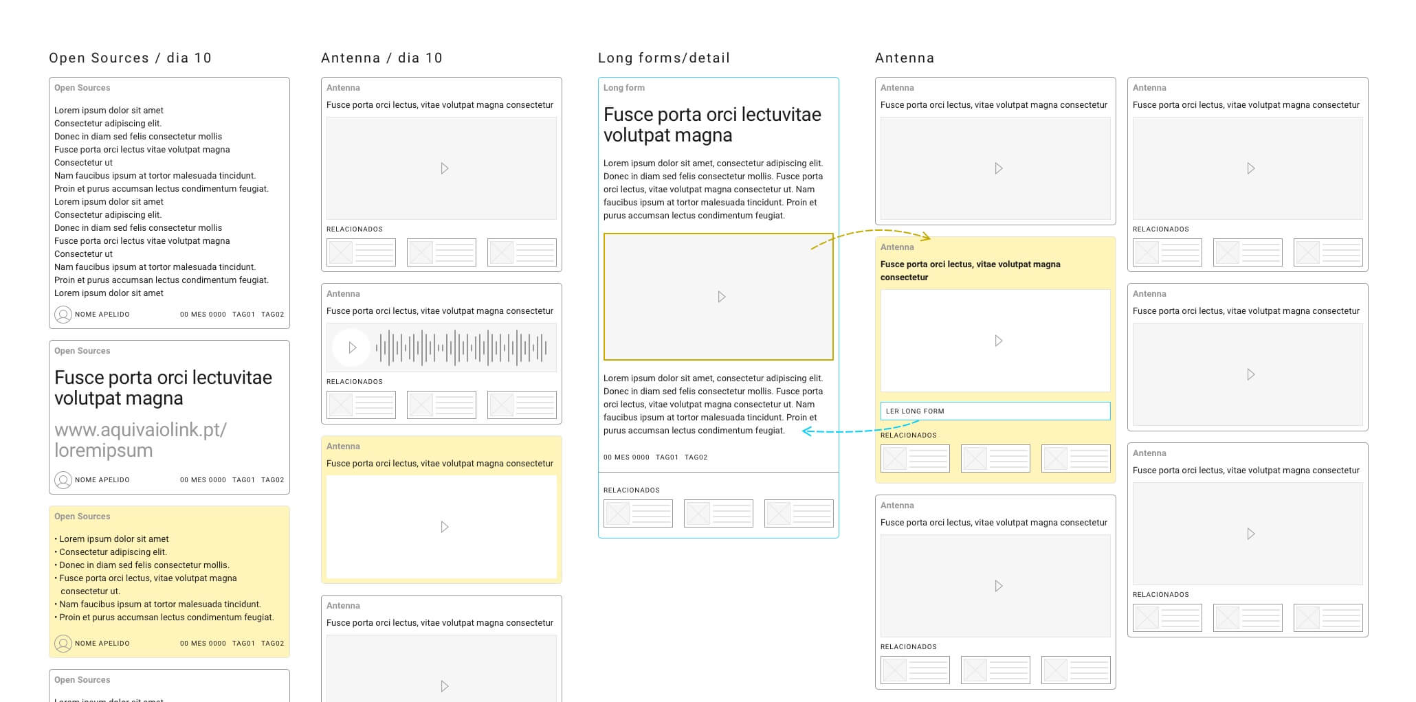
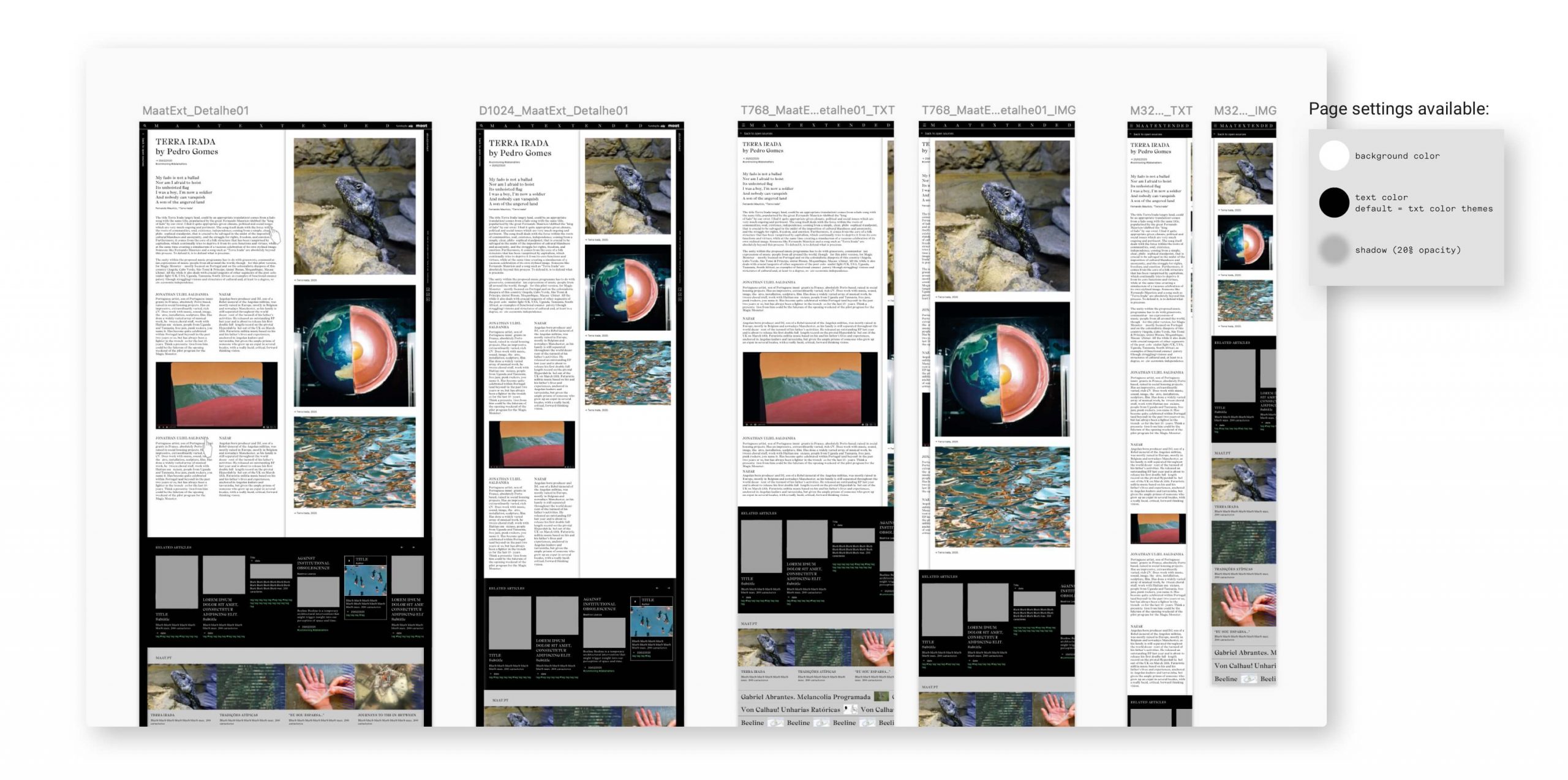
- 2 detail content page templates: a single-column layout and a two-columns (or side-by-side) reading panel layout.
- In the two-columns layout, scrolling is isolated on each side.
- Content pages haven’t got mandatory modules, providing flexibility to combine components in different page areas.
- It's also possible to define background and text colors for content detail pages, enhancing the diversity of article details.
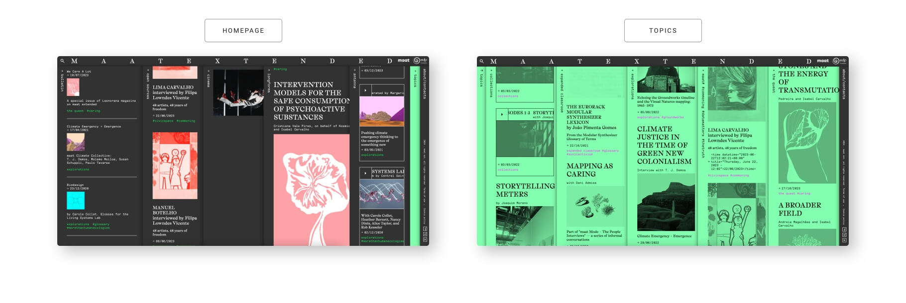
The final versions of the homepage and topics pages feature the same structure but follow different content rules. Both pages display the same cards but in two distinct organization formats.
Based on five content menus we created five types of cards:
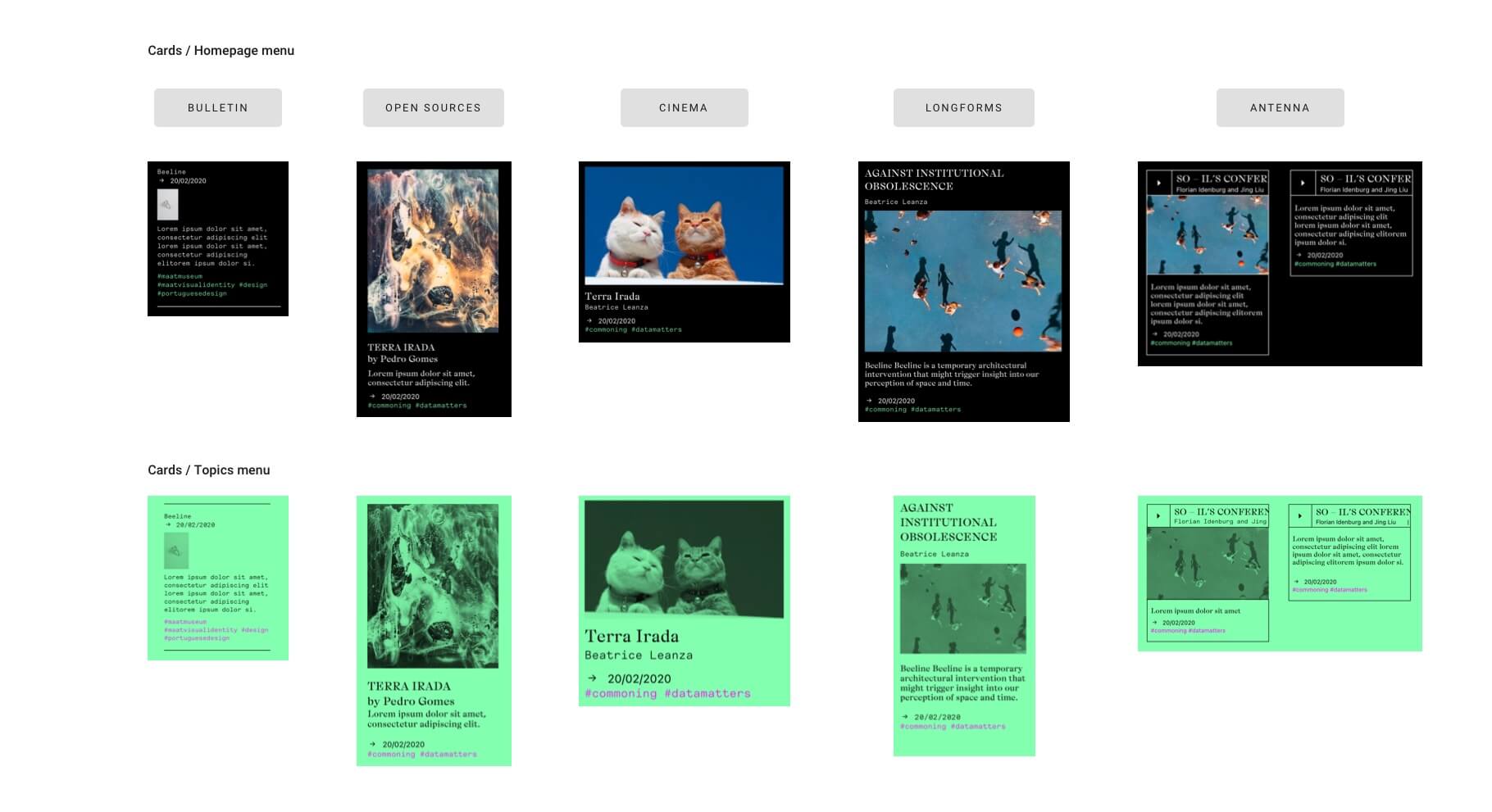
The five cards follow the color rules defined on home and topics pages.
On the topics page, images automatically follow the rule: filter: grayscale(100) + mix-blend-mode: multiply, which serves to emphasize a distinct way of viewing content.
Content page template 1 column:
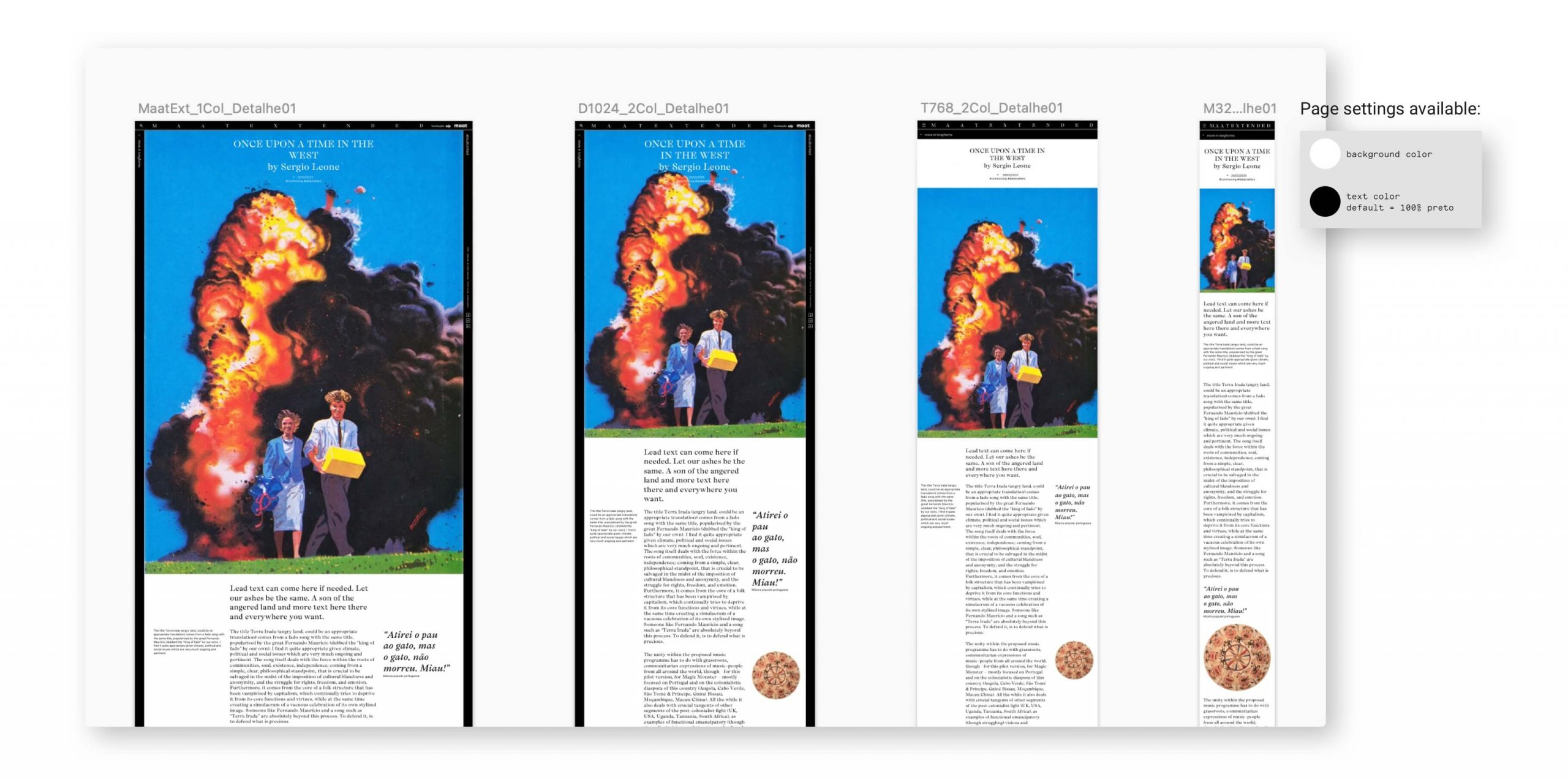
Content page template 2 columns:
Infinite combinations on content detail pages
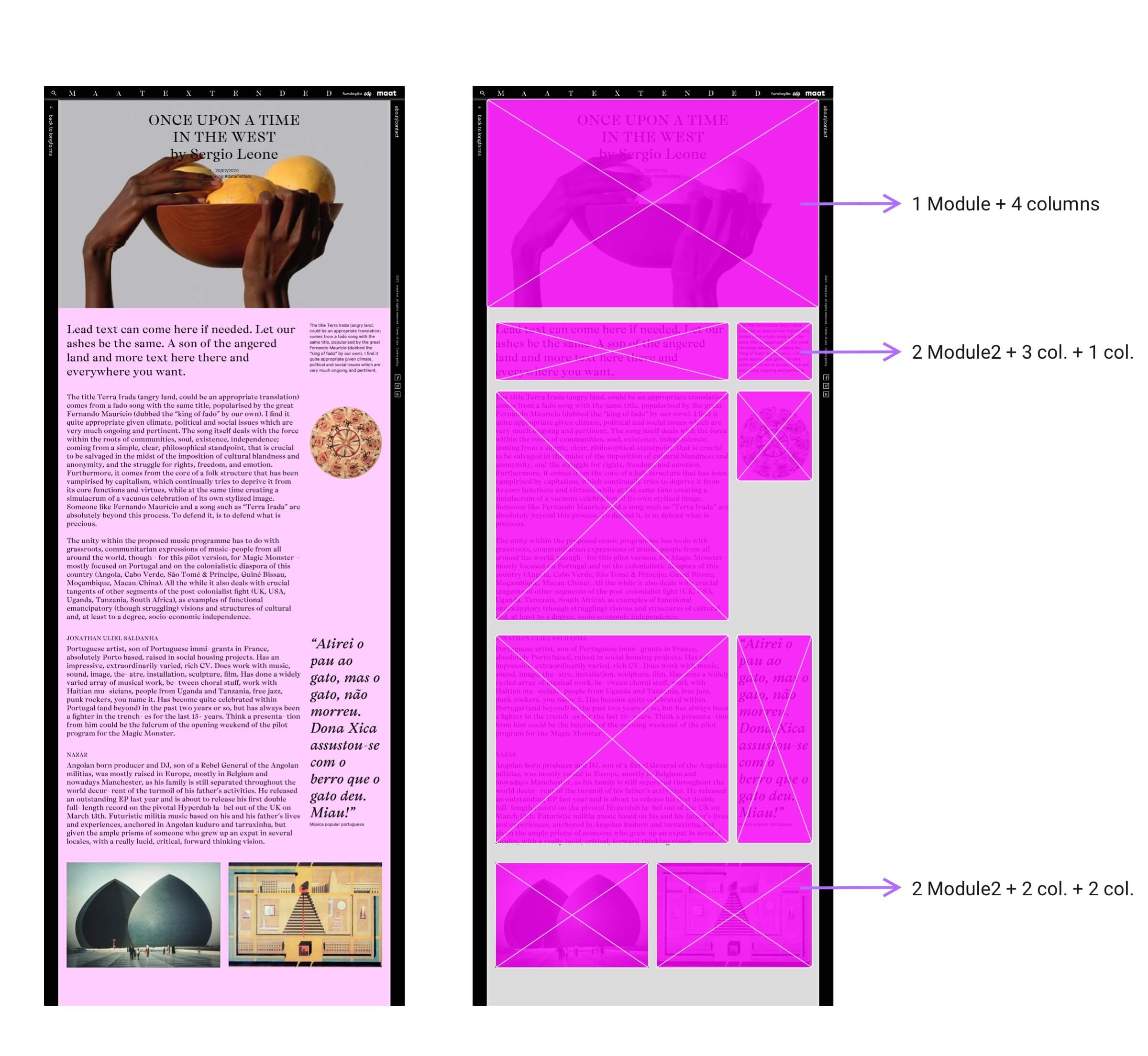
As there are no mandatory modules on article pages, the content editor for articles allows editors to select lines that can be populated with groups of modules (content containers). The height of these containers varies based on the length of the content.
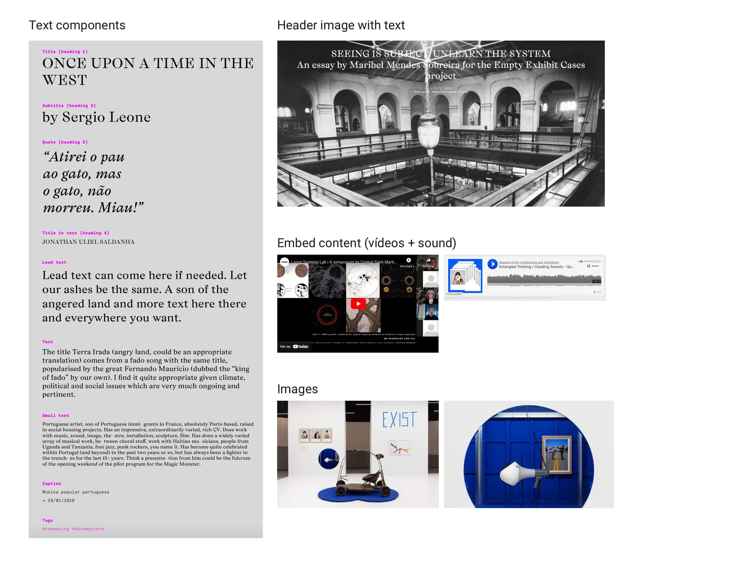
Within each module group, the editor has the freedom to choose which content module to use. The available options include:
- 9 text components (styles)
- 1 module for header image with heading text
- 1 module for embedding content (video or audio)
- 1 image container module
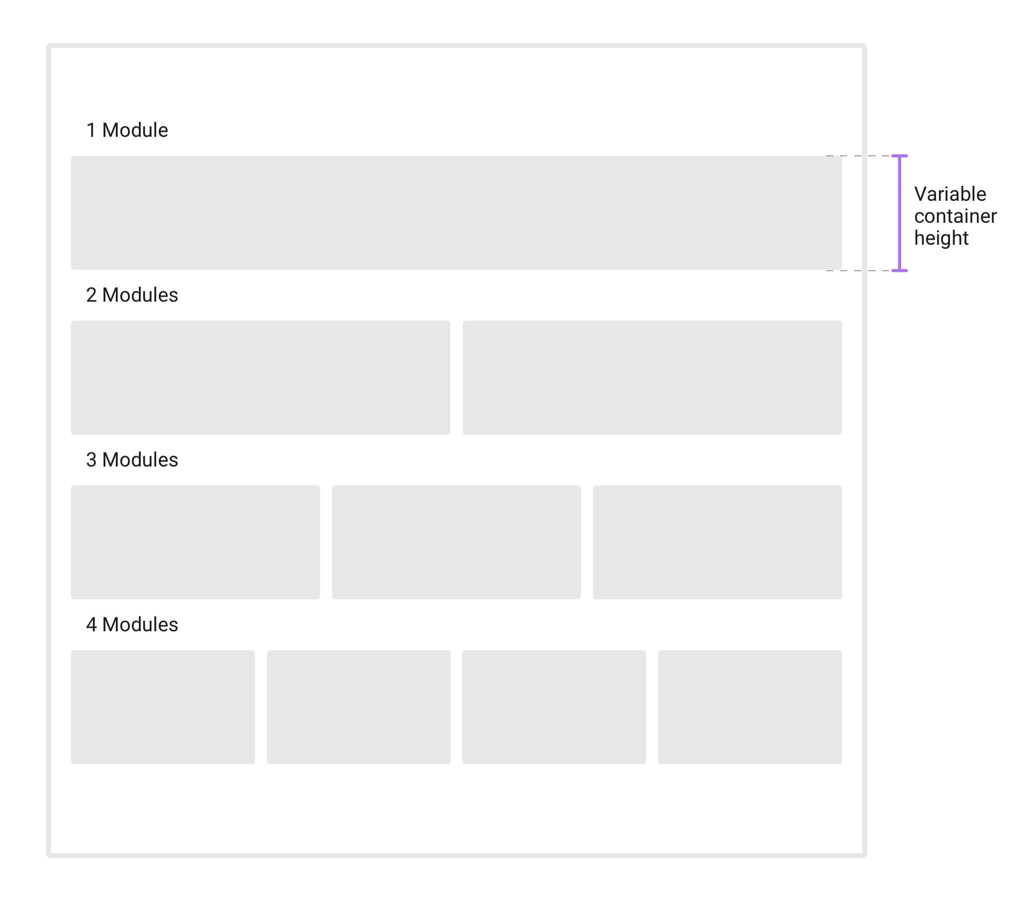
Modules of content containers:
Combination of content containers and modules:
N E V E R B O R E D